



Made for the moments between places.
CROSSING exists for the quiet parts of travel: the packing, the waiting, the walk to the gate, the arrival. Every object is designed to make movement feel calm, considered and beautifully simple.

Travel essentials with a quieter kind of confidence.
CROSSING was created for people who move through their day with intention. The brand is less about luggage as a status object and more about the feeling of being ready: everything organized, nothing over-designed, and every detail earning its place.
We design for the space between departure and arrival.
Those moments should feel easy. Our approach is simple: reduce visual noise, improve utility, and build pieces that make travel feel more instinctive. From the way a zipper opens to the way a pocket is placed, the experience should feel seamless before the journey even begins.
Four principles that guide every detail.
These principles define the visual and functional language of CROSSING. Select a card to keep it active while reviewing the page.
A city built on movement shapes how we design.
Singapore is compact, connected and constantly crossing between cultures. That gives CROSSING its point of view: products should feel cosmopolitan, adaptable and ready for different rhythms of travel.
Global function. Local restraint.
Our design language draws from Singapore's balance of precision and warmth: clean infrastructure, efficient movement and quiet hospitality. The result is travel gear that feels composed, practical and understated.
 Design
Travel
Arrival
Design
Travel
Arrival
Designed to feel intuitive before you even think about it.
Use the process panel to explore how a CROSSING product moves from observation to refinement. Each step is designed to reduce friction in the travel experience.


Observe the journey.
We start with the behaviors around travel: packing late, finding documents quickly, moving from taxi to terminal, and adapting to different trip lengths.
- Watch real packing habits
- Identify repeated travel friction
- Define what should feel easier
Simplify the form.
A CROSSING product should look calm from a distance and useful up close. We remove anything that does not improve the experience.
- Reduce visual noise
- Keep silhouettes timeless
- Let material and proportion lead
Prototype the details.
Handle feel, zipper paths, pocket placement and interior visibility are refined through repeated physical testing.
- Test access points
- Refine pocket hierarchy
- Balance structure and softness
Test in motion.
Products are evaluated in real transitions: bedroom to cab, curbside to check-in, train platform to hotel room.
- Assess rolling comfort
- Check access while moving
- Refine carry ergonomics
Refine for longevity.
The final product should feel current without becoming trend dependent. Color, materials and hardware are chosen for repeat use.
- Confirm material resilience
- Review warranty expectations
- Finalize the full travel system
Objects that make movement feel easier.
Each category has its own role in the system: luggage gives structure, bags add flexibility, accessories organize small details, and wallets protect what matters most.

Structure for every trip.
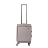
Our luggage is built around access and organization, with silhouettes that feel refined enough for the hotel lobby and practical enough for the overhead bin.
Soft utility for flexible days.
Travel bags are designed for the days around the flight: gym, office, weekend, or the extra things that never quite fit into a suitcase.
Small details, calmer packing.
Accessories give every small item a home, from adaptors and cables to toiletries and documents.
Protection for daily carry.
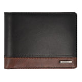
RFID wallets are made for the essentials you reach for most, balancing protection, leather warmth and slim everyday carry.
Warm neutrals, tactile surfaces and signature travel tones.
The brand system uses soft, natural colors to let the product textures lead. Accents are restrained and practical: olive for travel utility, bronze for leather warmth, charcoal for clarity.
Ivory
Primary background for pages and calm product storytelling.
#fbfaf7
Sand
Soft warmth for panels, modules and lifestyle surfaces.
#d2c3b3
Deep Olive
Signature product tone for luggage and grounded accents.
#2a4035
Charcoal
Primary text, navigation, buttons and high-contrast moments.
#11110f
Built around trust, not urgency.
The website should communicate practical confidence without shouting. Warranty, delivery and design claims are presented as quiet assurances that support the shopping experience.
Warranty coverage
Clear coverage language builds confidence before purchase and removes uncertainty after arrival.
Designed locally
Thoughtful details for dense city travel, short escapes and regional movement from Singapore.
One-stop kit
Luggage, bags, wallets and accessories designed as one cohesive travel system.
Free local delivery
Simple service messaging supports a premium but approachable eCommerce experience.
An image system built on atmosphere.
Photography should feel like quiet travel scenes: soft light, natural textures, generous negative space and product details that feel lived-in rather than staged.

 NEWSLETTER
